Time to Event Plot
tteplot.RdGenerate a flexible KM plot with a risk table
tteplot(data, group_by, param, paramcd = "PARAMCD", aval = "AVAL",
  cnsr = "CNSR", reverse = FALSE, confint = 0.8, title = "",
  xlab = "", ylab = "", caption = "", size = "small")
Arguments
| data | a dataframe containing the input data to plot (dataframe) |
|---|---|
| group_by | a column name containing a subgrouping factor to split the plot by (string) |
| param | the time-to-event parameter to plot (e.g. "OS") (string) |
| paramcd | the column name containing the parameter, default is "PARAMCD" (string) |
| aval | the column name containing the numeric analysis value, default is "AVAL" (string) |
| cnsr | the column name containing the censor value, default is "CNSR" (string) |
| reverse | boolean value controls whether the survival formula should be flipped, default is FALSE: Surv(CNSR - 1), if set to TRUE then behaves like Surv(1 - CNSR) (logical) |
| confint | confidence interval to calculate with, default is 0.8 (float between 0 and 1) |
| title | optional parameter, custom plot title (string) |
| xlab | optional parameter, custom x-axis plot label (string) |
| ylab | optional parameter, custom y-axis plot label (string) |
| caption | optional string to include as a caption on bottom of plot (string) |
| size | optional string to specify font size schema ("small" for PDF usage or "large" for Shiny apps) to use for plot, default is "small" (string) |
Value
produces a Kaplan-Meier type survival plot
Examples
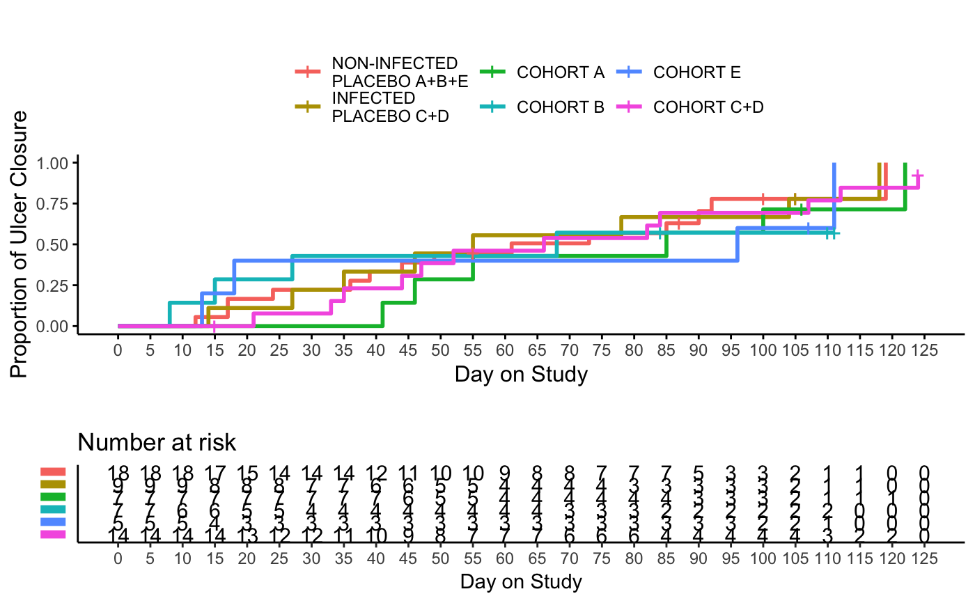
tteplot(
  data = ATE, group_by = "CHRT", param = "TFUC", reverse = TRUE,
  xlab = "Day on Study", ylab = "Proportion of Ulcer Closure"
)